Our brand
The guidelines that follow will help you correctly make use of our brand.
By using our brand assets, you indicate your acceptance of our Trademark Usage Guidelines and you understand that a violation of these guidelines will result in the termination of your license and/or permission to use our brand assets.
Our logo
This is our logo, the one that should always be used. There are two versions to ensure optimum legibility.

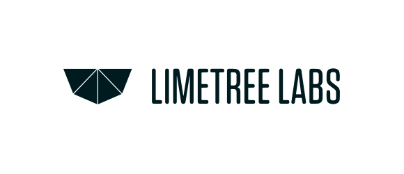
Logo
This is the main Limetree Labs logo. It shoud be used in this form whenever possible.

Inverted Logo
This version with the white wordmark works well on dark and busy backgrounds.
Our glyph
It's our logo stripped of its wordmark. Use it only when and where space is limited.


The main logo always comes first
However, in certain situations where space is very tight, for instance when the logo has to be within a square or circle shape, the use of the glyph is allowed.
Monotone logos
We love our main logo, so that should always be used if possible. These can be used as a substitute, only when absolutely necessary.
Monotone black

Monotone white
When can I used the monotone logos?
- When color is not an option or is too expensive to print
- Embroidered labels on apparel (branded merch)
- On top of busy photography when the full-color logo simply doesn't work
- When you have a bunch of logos bundled up together and want a clean monotone look
Spacing rules
Our logo works best when it has enough room to breath. Follow these simple rules to make sure it's shown in its best light.
Logo spacing
For this one to show its full potential, leave at least one glyph worth of space around it.

Glyph spacing
It's best to have at least one glyph at 25% the size around it.
Minimum size
Preserving legibility in both print and digital formats is crucial.
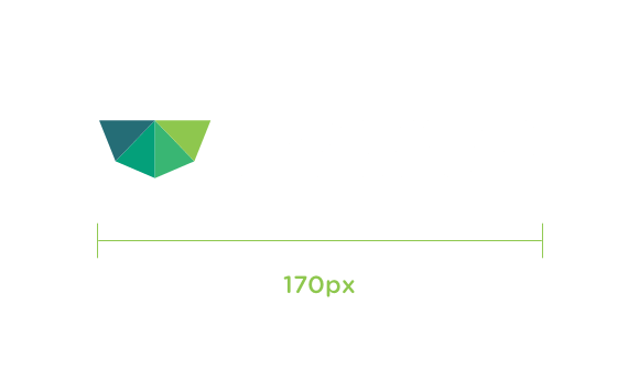
Digital
Our logo shouldn't be smaller than 170px in width.
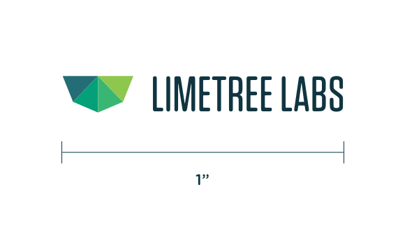
Printed, our logo shouldn't be smaller than 1" in width.
Best practices
Here's a few examples of what we should absolutely avoid when using the logo.
Don't stretch or squeeze it
Don't rotate it
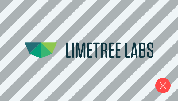
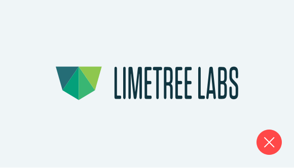
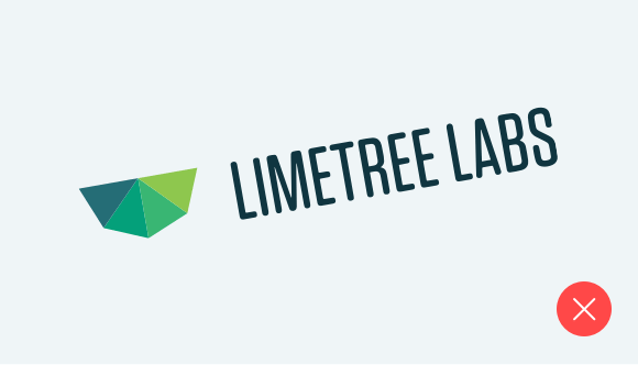
Don't use busy backgrounds
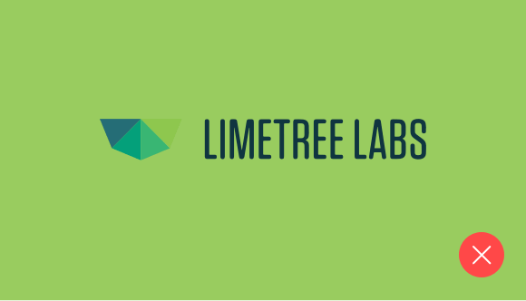
Don't use against low contrast
Don't use gradients or shadows